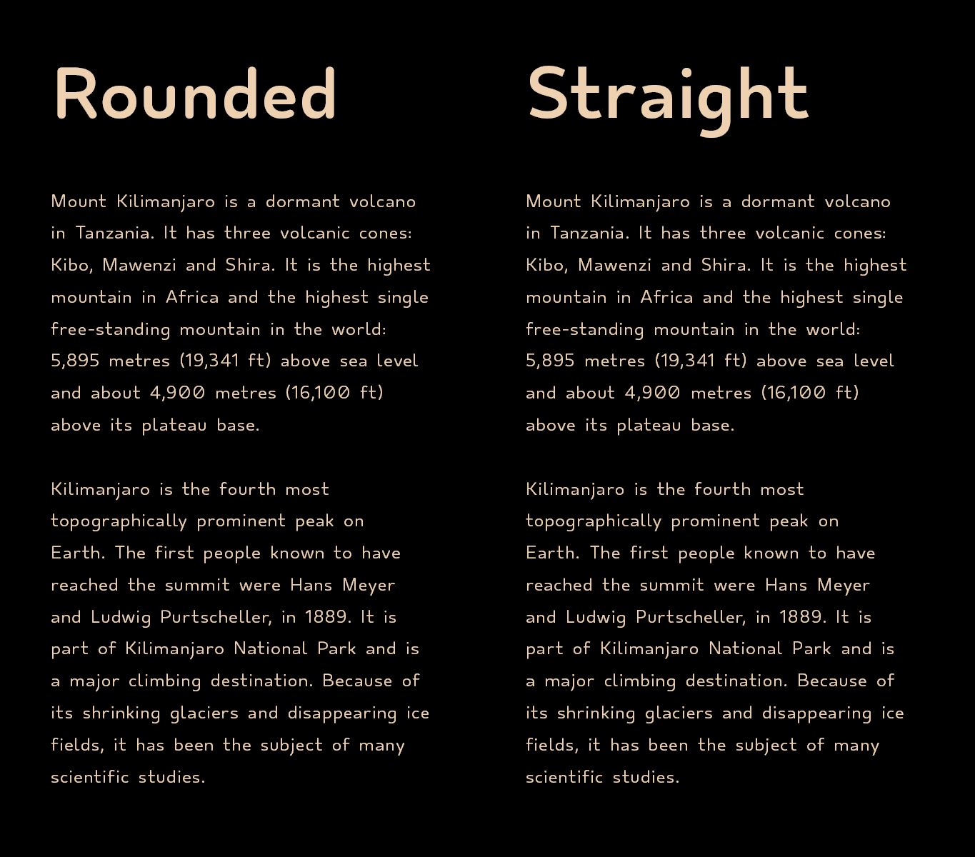
OT Carta Sans Rounded

OT Carta is a type family designed and adapted for people with dyslexia and other reading difficulties. Primarily intended for older readers who are already accustomed to reading sans serif letters (Helvetica, Arial, etc.). Fonts are compatible with Omoguru tools that help with reading, and allow each user to customize the options to their preferences and thus make reading easier.
While designing this typographic family, we determined key parameters to allow the user to more easily adjust the readability to their needs.

OT Carta Rounded comes with the Standard version and the Extended version which has enlarged capital letters, ascenders and descenders. Each group consists of six cuts (Thin, Light, Regular, Medium, Bold, Black) and four widths (One, Two, Three, Four) with appropriate italics (oblique). Which allows a wide range of choices.
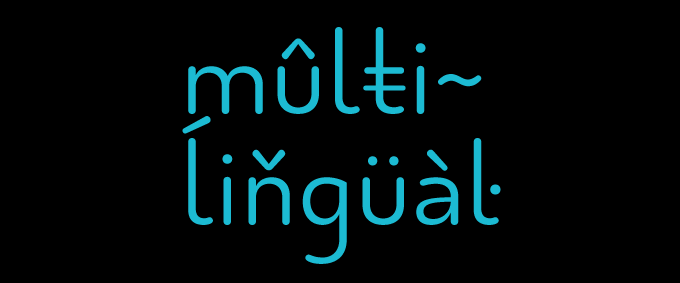
Font consists of 400 characters, a character set that supports most of Latin based languages.

We wanted to avoid adding excessive visual elements to “improve” readability, so attention was paid to the diversity of similar characters such as 1Il, nu, 0O.

As in all OmoType letters, symmetrically opposite letters bdpq can be additionally marked to avoid confusion when reading. This function is available through the Omoguru mobile app.

OT Carta is designed by Nino Bodac for OmoLab.